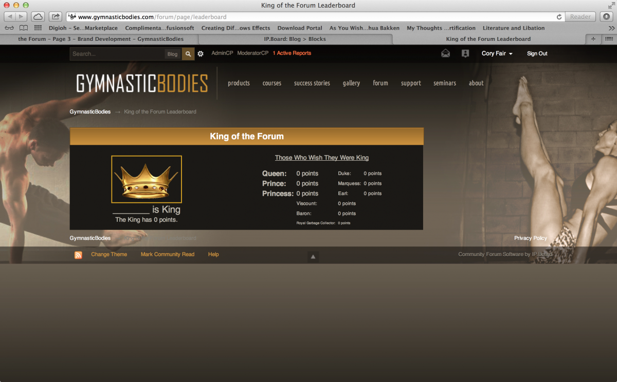
Maybe start the second column with Duke
More padding between columns
This forum is archived information and is no longer active.
Started by Cory Fair, March 21, 2013 · 85 Replies · 316 Views
Maybe start the second column with Duke
More padding between columns
Cole Dano said:Maybe start the second column with Duke
More padding between columns
https://www.gymnasticbodies.com/forum/page/leaderboard
Should I keep Viscount and below centered or asymmetrical to the right?
actually looking at it I think you could just do a third column
Compare:
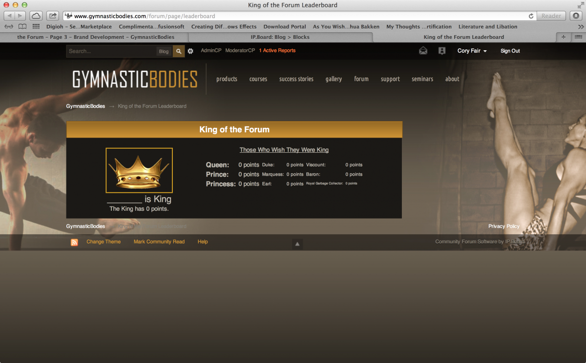
- Still too large and perhaps too distracting for someone just arriving on the main forum page for the first time.
- Perhaps even further reduced and moved to the right hand column under inbetween recent topics and status updates?
- Is the popout option a possiblity?
Coach Sommer said:- Still too large and perhaps too distracting for someone just arriving on the main forum page for the first time.
- Perhaps even further reduced and moved to the right hand column under inbetween recent topics and status updates?
Doable. the only problem is we end up with far more content on the right hand column than we have forum listings.
- Is the popout option a possiblity?
Are they clicking a link or simply an image that expands into the table?
I was thinking of an image that expands.
Do you think folks will know to click it?
I think Cory can reduce the height of the widget quite a bit
Crown / King text / Queen.. / Duke... / Viscount.. ?
It's a short run event and I'd think we want to keep it in people's faces to keep generating excitement
Coach Sommer said:I was thinking of an image that expands.
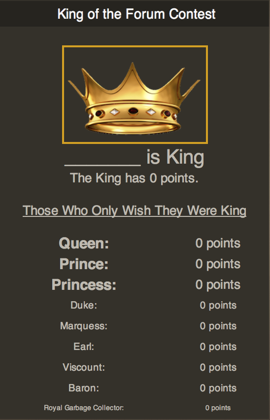
Something like this that expands into a lightbox to show the full board?
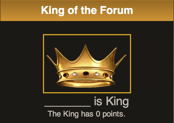
Cole Dano said:
It's a short run event and I'd think we want to keep it in people's faces to keep generating excitement
The goal is to make it feel like it's continually going on: with challenges being randomly spaced the idea is to keep them on their toes.
OK, then the pop out makes more sense.
- Yes, I agree - for the one's who are already participating on the forum.
- However we also have a great many new visitors and I would not want the "king of the forum" to distract them from properly focusing on the available courses, seminars and forum content.
Yes, I was misunderstanding this as short duration happening. The pop out on the side makes much more sense as a long term item.
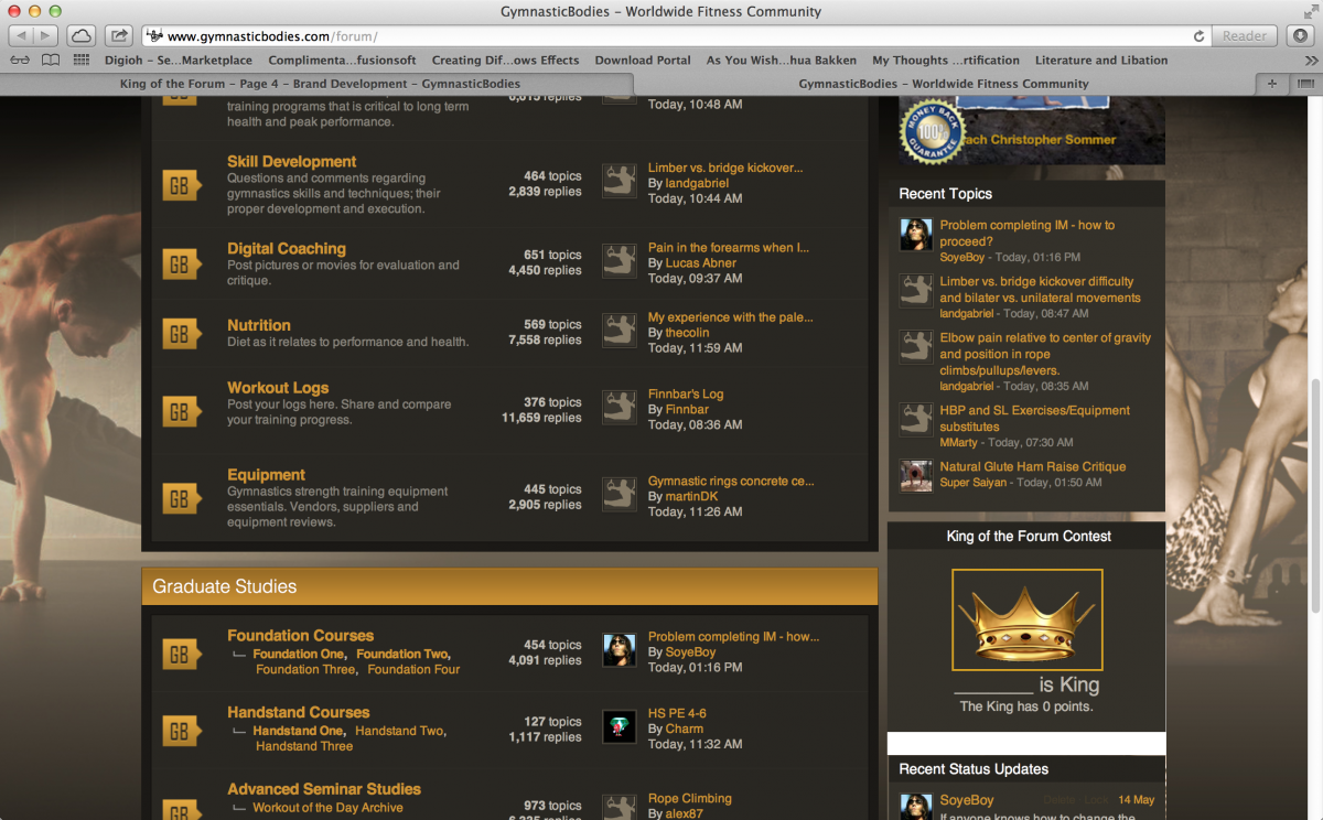
To recap, the King of the Forum Image (pop-up to full when clicked) will go between "Recent Topics" and "Status Updates" and be sized to the same width and a height that makes the sidebar end evenly with the bottom of the forum list?
That's what I was considering. What are your opinions?
Coach Sommer said:That's what I was considering. What are your opinions?
Works for me.
Sounds good and I like Cory's proposed graphic
Would it be better if the header read - King of the Forum Contest / Competition
That sounds much better.
I'll make the change. Any other details we need prior to an official announcement?
Mock up forum for the points and all is looking good.
Can we see a mock up of the proposed layout?
Sure. Would we be better switching to the grey titlebar?
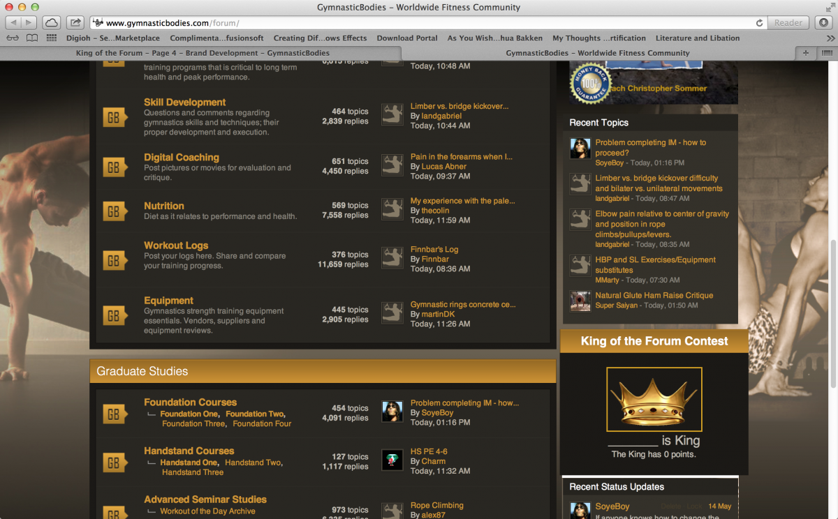
- I think so and let's shrink it down so that the margin edges line up.
- Also seems as though the wording still needs refining.
Mockup:
Full leader board with new style:
What if we put it above "Recent Topics" instead?
Let's try moving it.