Just a couple ideas I had for visually explaining GB as a unified curriculum. Below are some very rough sketches I made. Dimensions, scale, colors, and graphics are placeholder.
Curriculum Master Graphic
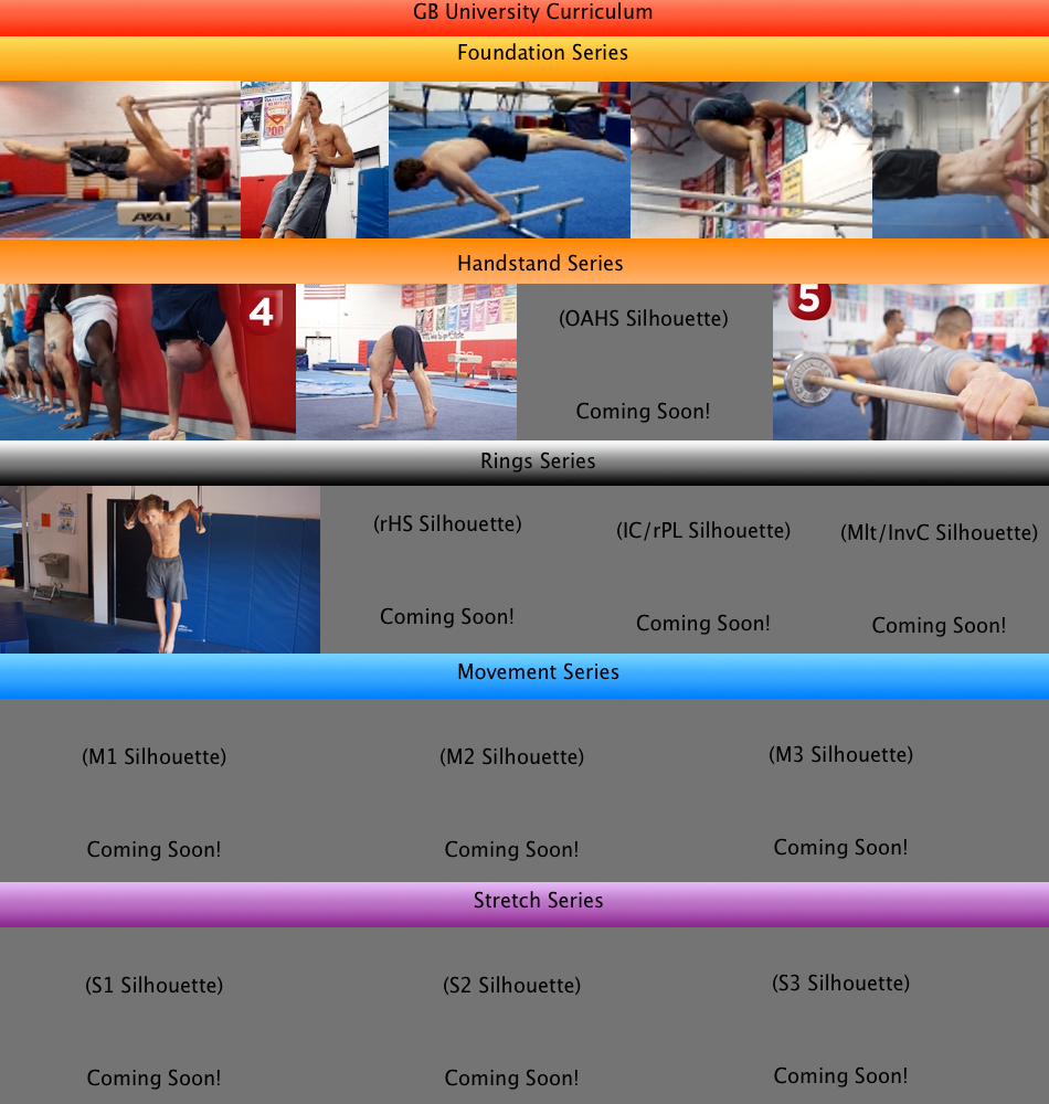
Concept is to combine the best visuals from each series into one master visual to use on homepage, Facebook, marketing, etc. The silhouettes would give a strong visual idea of what's to come and to prevent white space. As we announce a release month, we would plug that into the "Coming Soon" area. Otherwise, we'd only show the silhouette.
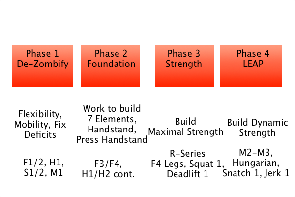
Imagine the boxes are the arrow style seen at the top here. I've wondered if it may be helpful to break the whole curriculum down into phases. I placed four in the example, though Coach would do a much better job at deciding the number and names of the phases.

The graphic would function like tabs where only one phase's box shows below at a time. Each box has a short description and maybe picture about that phase. Below that is a line break and then the bottom line of the tab would read "Courses: X, Y, Z."
This interactive phases item would be potentially either on one of the homepage pages, in marketing emails, or within the course itself.
I want us to be able to visually express the essence of the GB University Curriculum in a few seconds. From a landing page design perspective that means the user has a first impression of the page (color scheme, elements style, graphics/photos), then has their attention focused on a primary visual for the curriculum, then has their eyes drawn from the graphic to the email harvest or purchase now button. In short:
1) Overall Impression
2) "Getting it" for what we're about
3) Purchase or Request Info
If the visitor can get to the call to action/purchase in under that 10 seconds, it will take less than 20 for most people to fill out the harvest or start on the purchase process.